Start with the journey, not the search box
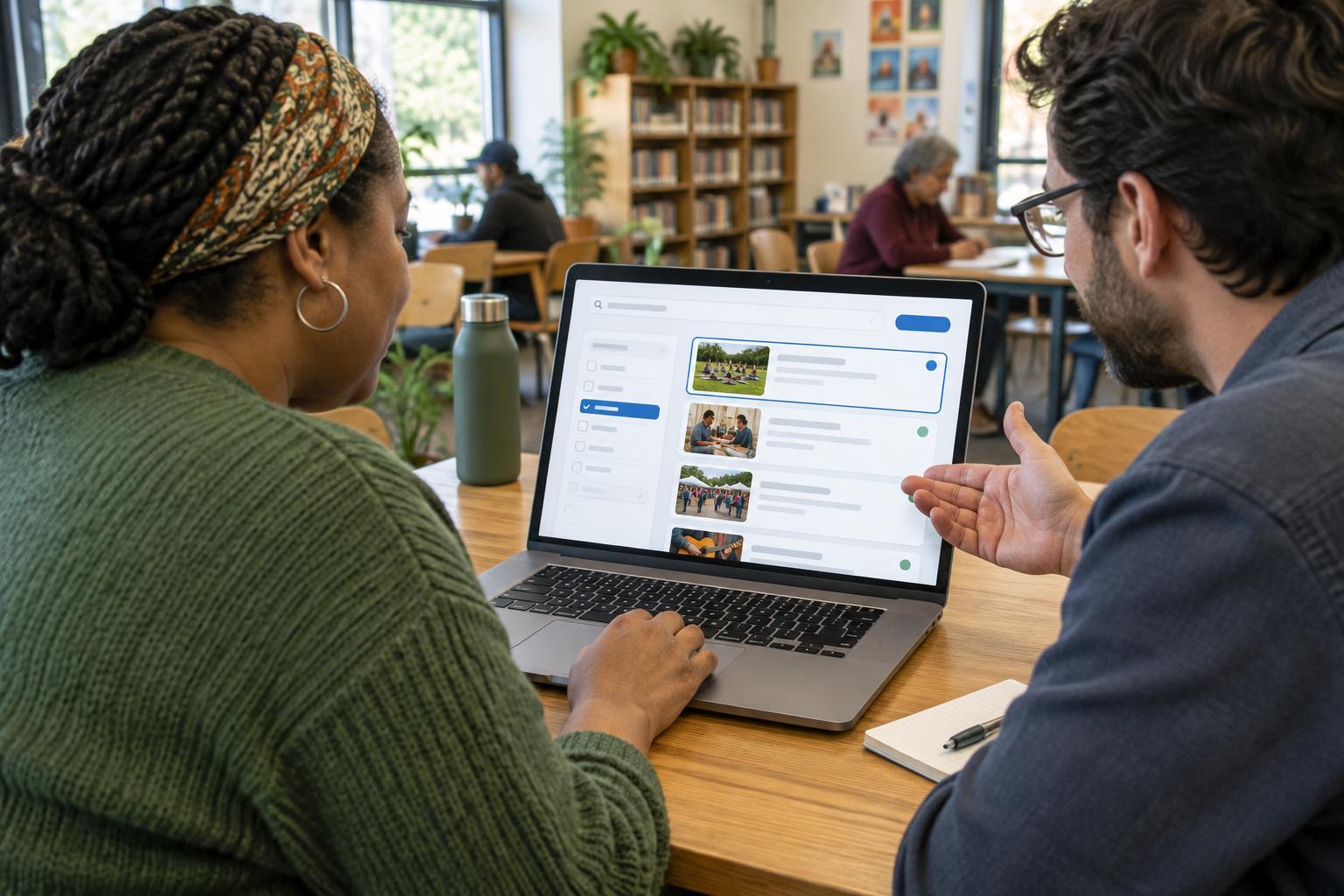
Imagine a community events directory where someone wants to find a free workshop near home. They may search for a topic, choose a location, select a date and compare several results. Each step needs to make sense on its own, but the steps also need to work together. A search field that is easy to find does little good if applying a filter unexpectedly clears the query.
Map the journey before changing the interface. What happens when the visitor enters a term, submits it, adds a filter or removes one? Can they tell which choices are active? Can they return to a useful result after opening an event and going back? Answering these questions helps a team find barriers that a review of individual controls might miss.
Make searching predictable
Give the search field a visible label that describes what people can search for, such as “Search events,” rather than relying on example text inside the field. Include a clearly named submit button. If searches run as someone types, avoid changing the page so abruptly that they lose their place or cannot finish entering a term. A conventional submit action can be easier to understand and test.
Suggestions can help with spelling or unfamiliar terms, but they should not be the only way to search. People need to be able to ignore suggestions and submit their own words. If a suggestion list appears, keyboard users should be able to reach and choose its options, while assistive technology users should be able to understand what appeared and which option is selected. A simpler search without suggestions is often preferable to suggestions that behave inconsistently.
Let filters explain themselves
Group related filters under clear names: location, cost and date are more useful labels than a long, undivided list of checkboxes. Use familiar controls where possible, and make each choice understandable without relying on color or position alone. “Free” and “Paid” say more than two unlabeled switches. If several choices can be selected within one group, make that behavior apparent.
After a filter is applied, keep its selected state visible and provide a straightforward way to remove it. A “Clear all filters” action can help, but it should not be the only way to undo a single choice. Consider a visitor who selects “Free” and then tries a different location: they should not have to reconstruct the whole search. If filters apply automatically, explain that behavior and make sure changes do not unexpectedly move keyboard focus.
Show what changed in the results
A results page should answer three questions quickly: what was searched, which filters are active and what matches were found. Use a descriptive results heading and present each item with enough information to compare it with others. In the events example, an event name alone may not be enough; a location, time and cost can help someone decide whether to open the detail page. Make the link text distinguishable so a person browsing links does not encounter a list of identical “Learn more” actions.
When results update without a full page load, make the change understandable to people using assistive technology. A brief results-count announcement may help, but avoid repeated announcements while someone is still typing or choosing filters. An empty-results message should name the problem without blaming the visitor and offer a useful next step, such as removing a filter or trying a broader term.
Test the whole task and keep improving it
Try realistic tasks rather than checking controls one at a time. Find a free event, narrow it to a location, open a result and return to change the search. Repeat the task using only a keyboard, at higher zoom and with a screen reader if your team has the means to test one. Notice whether focus remains visible, labels make sense out of context and earlier choices survive a return from the detail page. Testing with people who use assistive technology can reveal difficulties that a checklist does not.
Search accessibility is part of helping people find information, but it is not the same as promoting a site. For broader browsing on online visibility, explore Strategia Widoczności; for local discoverability topics, browse Widoczność lokalna · Strategia Widoczności; and for measurement and improvement topics, visit Pomiar i rozwój · Strategia Widoczności. Within your own directory, start improvements with the points where people lose their query, cannot identify an active filter or cannot understand why the results changed.